728x90
반응형
kaggle 튜토리얼 competition 격인 titanic 분석
https://www.kaggle.com/code/sunghwankang/titanic
- 최고 점수: 0.79904 (Random Forest)
- 피쳐: Pclass, Sex, Age, SibSp, Parch, Fare, Embarked
- Pclass, Sex, Embarked 피쳐 One-Hot 인코딩
- numerical 컬럼 결측치 median 사용
XGBoost로 변경 후에 오히려 0.74로 점수가 낮아졌는데, overfitting을 완화하는 방향으로 hyperparameter를 조정하니 0.76으로 약간 상승. 최적 파라미터를 찾기 위한 grid search는 해보지 않음.
EDA
correlation
hm_df = train_data[['Survived', 'Pclass', 'Sex', 'Age', 'SibSp', 'Parch', 'Fare']]
hm_df['Sex'] = hm_df['Sex'].map({'male':0, 'female': 1}).astype(int)
sns.heatmap(hm_df.corr(), cmap=plt.cm.RdBu, annot=True, linewidths=1)
Survived는 Sex, Pclass, Fare와 높은 상관관계를 보임
컬럼별 Survived 비율
fix, ax = plt.subplots(nrows=1, ncols=5, figsize=(20, 5))
sns.barplot(data=train_data, ax=ax[0], y='Survived', x='Pclass')
sns.barplot(data=train_data, ax=ax[1], y='Survived', x='Sex')
sns.barplot(data=train_data, ax=ax[2], y='Survived', x='SibSp')
sns.barplot(data=train_data, ax=ax[3], y='Survived', x='Parch')
sns.barplot(data=train_data, ax=ax[4], y='Survived', x='Embarked')
Sex에 따라 Survived 비율이 뚜렷하게 구분
Survived 별 Age 분포
lbl_survived = 'survived'
lbl_not_survived = 'not survived'
fig, ax = plt.subplots(figsize=(5, 3))
ax = sns.distplot(train_data[train_data.Survived == 1].Age.dropna(), ax=ax, bins=20, label=lbl_survived)
ax = sns.distplot(train_data[train_data.Survived == 0].Age.dropna(), ax=ax, bins=20, label=lbl_not_survived)
ax.legend()
ax.set_ylabel('KDE')

females = train_data[train_data.Sex == 'female']
males = train_data[train_data.Sex == 'male']
fig, axes = plt.subplots(nrows=1, ncols=2, figsize=(10, 4))
ax = sns.distplot(females[females.Survived == 1].Age.dropna(), ax=axes[0], bins=30, kde=False, label=lbl_survived)
ax = sns.distplot(females[females.Survived == 0].Age.dropna(), ax=axes[0], bins=30, kde=False, label=lbl_not_survived)
ax.legend()
ax.set_title('Female')
ax = sns.distplot(males[males.Survived == 1].Age.dropna(), ax=axes[1], bins=30, kde=False, label=lbl_survived)
ax = sns.distplot(males[males.Survived == 0].Age.dropna(), ax=axes[1], bins=30, kde=False, label=lbl_not_survived)
ax.legend()
ax.set_title('Male')
Female은 모든 나이대에 걸쳐 생존률이 높음
Male은 어린 나이(약 2~3세)와 80세 부근에서만 생존률이 더 높음
모델 구성 (pipeline)
from sklearn.compose import ColumnTransformer
from sklearn.impute import SimpleImputer
from sklearn.pipeline import Pipeline
from sklearn.preprocessing import OneHotEncoder
from xgboost import XGBClassifier

onehot_encoder = OneHotEncoder(sparse_output=False)
median_imputer = SimpleImputer(strategy="median")
column_transformer = ColumnTransformer(
    [
        ("categorical", onehot_encoder, ["Pclass", "Sex", "Embarked"]),
        ("numerical", median_imputer, ["Age", "SibSp", "Parch", "Fare"]),
    ],
    verbose_feature_names_out=False,
)
pipeline = Pipeline(
    [
        ("preprocessing", column_transformer),
        ("classifier", XGBClassifier(n_estimators=500, learning_rate=0.02, subsample=0.9, gamma=1)),
    ]
)

pipeline.fit(X_train, y_train)
Feature Importance (XGBoost)
Gain
# XGBoost feature importances (https://mljar.com/blog/feature-importance-xgboost/)

feature_names = pipeline[:-1].get_feature_names_out()
mdi_importances = pd.Series(pipeline[-1].feature_importances_, index=feature_names).sort_values(ascending=True)

ax = mdi_importances.plot.barh()
ax.set_title("XGBoost Feature Importances (gain?)")
ax.figure.tight_layout()
Permutation Importance
# permutation importance

from sklearn.inspection import permutation_importance

result = permutation_importance(pipeline, X_train, y_train, n_repeats=10, random_state=1, n_jobs=2)

sorted_importances_idx = result.importances_mean.argsort()
importances = pd.DataFrame(result.importances[sorted_importances_idx].T, columns=X_train.columns[sorted_importances_idx])
ax = importances.plot.box(vert=False, whis=10)
ax.set_title("Permutation Importances")
ax.axvline(x=0, color="k", linestyle="--")
ax.set_xlabel("Decrease in accuracy score")
ax.figure.tight_layout()
SHAP
import shap
shap.initjs()
explainer = shap.Explainer(pipeline[-1], feature_names=feature_names)
observations = pipeline[:-1].transform(X_train)
shap_values = explainer(observations)
# summarize the effects of all the features
print("""\
To get an overview of which features are most important for a model we can plot the SHAP values of every feature for every sample.
The plot below sorts features by the sum of SHAP value magnitudes over all samples, and uses SHAP values to show the distribution of the impacts each feature has on the model output.
The color represents the feature value (red high, blue low).""")
shap.plots.beeswarm(shap_values)
# bar plot
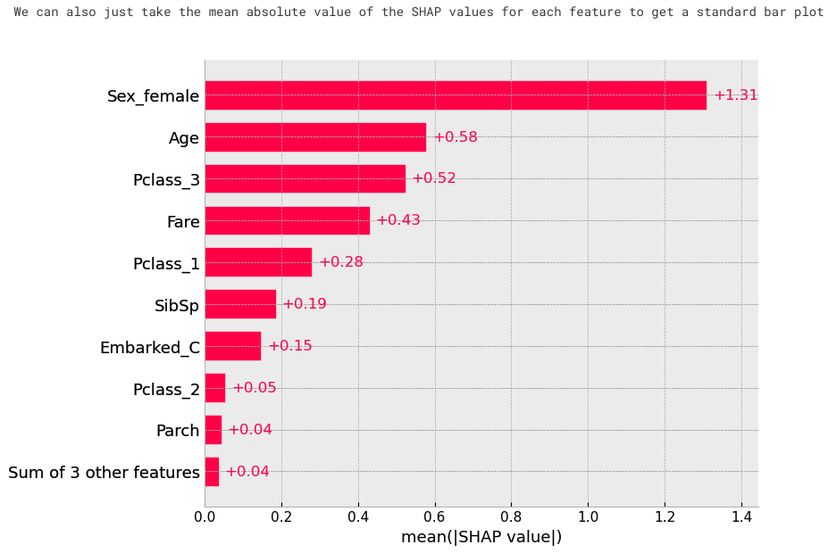
print("We can also just take the mean absolute value of the SHAP values for each feature to get a standard bar plot")
shap.plots.bar(shap_values)
# create a dependence scatter plot to show the effect of a single feature across the whole dataset
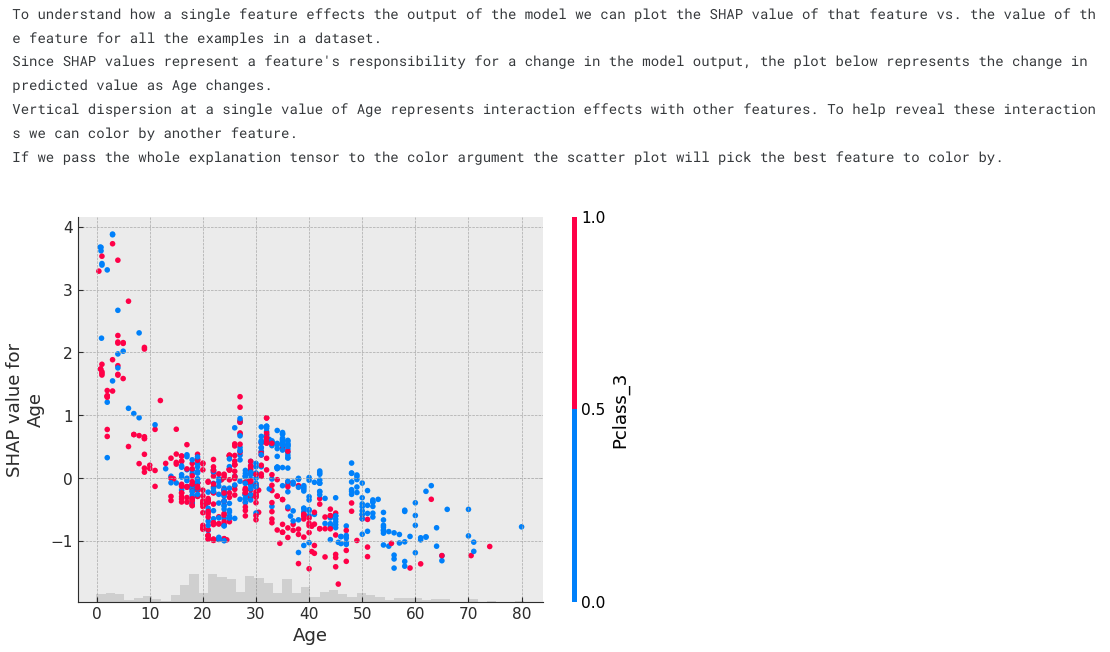
print("""\
To understand how a single feature effects the output of the model we can plot the SHAP value of that feature vs. the value of the feature for all the examples in a dataset.
Since SHAP values represent a feature's responsibility for a change in the model output, the plot below represents the change in predicted value as Age changes.
Vertical dispersion at a single value of Age represents interaction effects with other features. To help reveal these interactions we can color by another feature.
If we pass the whole explanation tensor to the color argument the scatter plot will pick the best feature to color by.""")
shap.plots.scatter(shap_values[:,"Age"], color=shap_values)
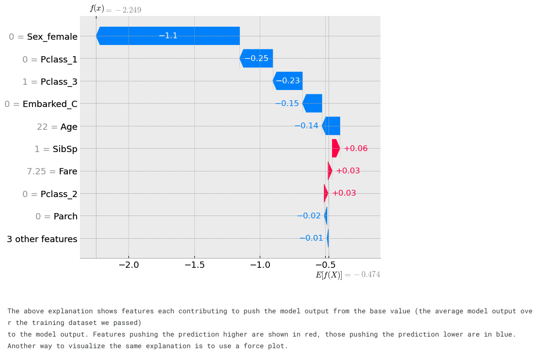
# visualize the first prediction's explanation
shap.plots.waterfall(shap_values[0])
print("""\
The above explanation shows features each contributing to push the model output from the base value (the average model output over the training dataset we passed)
to the model output. Features pushing the prediction higher are shown in red, those pushing the prediction lower are in blue.
Another way to visualize the same explanation is to use a force plot.""")
# visualize the first prediction's explanation with a force plot
shap.plots.force(shap_values[0], matplotlib=True)
# visualize all the training set predictions
print("If we take many force plot explanations such as the one shown above, rotate them 90 degrees, and then stack them horizontally, we can see explanations for an entire dataset")
shap.plots.force(shap_values)

Tree 확인 (XGBoost)
xgbclassifier 1번 tree
from xgboost import plot_tree

xgb = pipeline[-1]
xgb.get_booster().feature_names = list(feature_names)
fig, ax = plt.subplots(figsize=(30, 30))
plot_tree(xgb, num_trees=1, rankdir='LR', ax=ax)
plt.show()

dump_list = xgb.get_booster().get_dump()
print("number of trees:", len(dump_list))
반응형
'AI,머신러닝 > AI,ML 연습' 카테고리의 다른 글
| (dacon) 농산물 가격 예측 (시계열 분석) (4) | 2023.12.05 |
|---|---|
| (dacon) 축구선수 유망 여부 예측 (0) | 2023.11.29 |